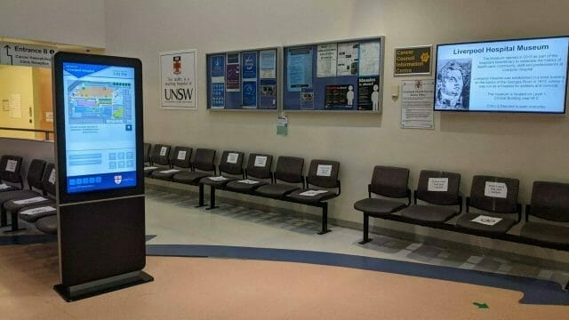

Designing User Experiences (UX) for digital signage is fundamentally distinct from designing for mobile phones or desktop monitors. Screen distances are measured in meters rather than inches; viewing angles fluctuate wildly; and ambient lighting conditions range from sun-drenched glass atriums to dim hospitality lounges. In this technical review, we analyze the front-end rendering architecture, typography choices, and layout design engine in Photos AdvertiseMe.

1. The Layout Engine: Responsive Flex & Grid Systems
Photos AdvertiseMe avoids rigid pixel-fixed positioning in favor of responsive CSS layout algorithms that fluidly adapt to any screen dimension—from compact 10-inch tablets to colossal 16:9 and 32:9 ultra-wide video walls:
- Dynamic Aspect Ratio Adaptation: The engine analyzes incoming photo aspect ratios (3:2, 4:3, 16:9, 1:1, 9:16) and calculates optimal fit boundaries without distorting or artificially stretching subjects.
- Configurable Gap & Corner Tokens: Designers can dial in card padding and border radius (e.g., 16px) to match the surrounding architectural finishes of physical frames and enclosures.
2. Typography and Legibility Metrics
Legibility on public screens depends heavily on character distinction and optical contrast. Photos AdvertiseMe curates four high-performance typefaces suited for specific architectural environments:
- Inter: Engineered specifically for computer screens, Inter features tall lowercase x-heights and distinguished glyph forms (such as disambiguated 1, l, and I), ensuring captions remain legible from 30 feet away.
- Montserrat: A geometric sans-serif based on urban signage in Buenos Aires. Highly effective for bold headline banners and promotional announcements.
- Playfair Display: A transitional serif with expressive swashes and graceful contrast, bringing an editorial high-fashion aesthetic to gallery and boutique screens.
- Roboto: Google’s signature neo-grotesque typeface offering clean geometric curves and reliable reading rhythm across wide viewing angles.

3. Color Tokens and Environmental Contrast
Public displays must comply with visual accessibility standards (such as WCAG 2.1 contrast ratios of at least 4.5:1 for normal text and 3:1 for large text). Photos AdvertiseMe enables administrators to define individual primary, accent, card, text, and background color tokens, ensuring optimal optical contrast regardless of room lighting.
Furthermore, the OLED Pure Black setting (#000000) eliminates letterboxing backlight bleed, creating a striking infinite-contrast effect that transforms standard screens into premium visual installations.
Design Exceptional Signage Experiences Today
Harness responsive layouts, professional typography, and custom color palettes with Photos AdvertiseMe. Free, instant, and fully customizable.
Conclusion
Great digital signage is where engineering meets environmental aesthetics. By providing thoughtful typography pairings, flexible responsive layouts, and OLED optimization, Photos AdvertiseMe proves that web-based signage can deliver a world-class visual experience with zero technical friction.